Showing posts with label interior design. Show all posts

Monday, September 19, 2016

Thomas' Nursery

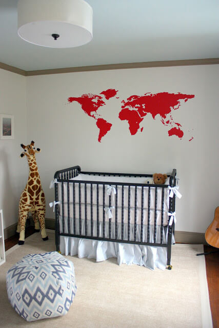
I’m a bit in denial that we will be moving at the end of this week.  There are so many things to do before then!  But before everything is packed up, it was important to me to document Thomas’ nursery.  It is such a special room because it is his first.  
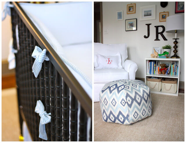
I'm so grateful that I had taken the time to photograph James Robert’s room so that even after we moved, I could remember fondly all of the details (more on that here). And I couldn’t not do that for Thomas!

We currently live in a rental, so decorating this nursery had more restrictions in terms of what I could change and do.  Also, because I knew we would be in it for a limited time, I didn’t want to invest heavily or make too many holes in the wall.

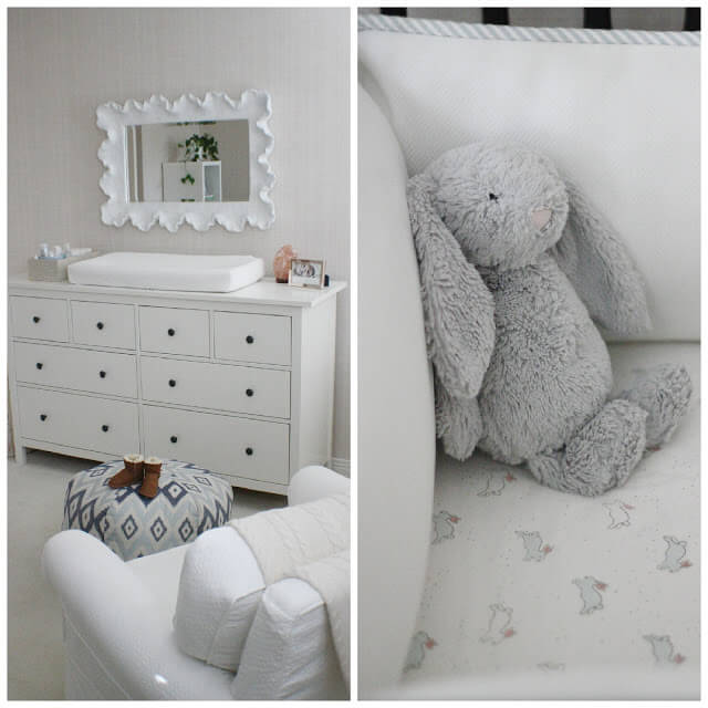
Many of the pieces in his room are repurposed from James Robert's nursery or other rooms from our previous house.  The nursery together organically mixing what we had on hand which further supports my theory that if you only buy what you love, it will have longevity and you'll always be able to find a spot for it. 
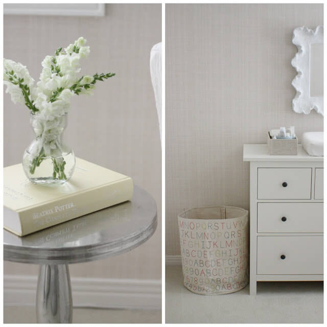
I got lucky with the natural grass cloth wallpaper in this room.  It adds a lot of texture to the space and allowed me to get away with less on the walls.  I love how cozy it feels!

My original inspiration was here. And the end result is close to what I had in mind.  It is simple, mostly neutral but full of sentiment.  For example, the print is a special prayer from Brim Papery and the cable knit blanket from Boll and Branch is a sweet gift from Thomas' Aunt and Uncle.  

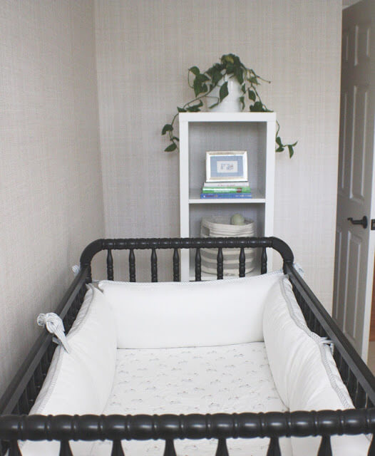
I did get a few new items for Thomas' nursery such as the crib sheet; I'm absolutely smitten with the bunny crib sheet from Pehr Designs. 
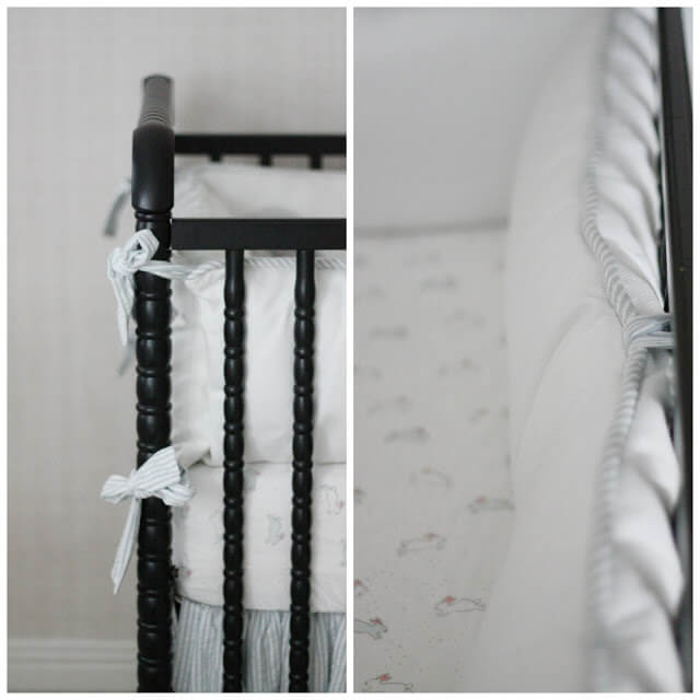

And I love using fabric bins to add additional pattern to the room. I was gifted a collection of small gray and white ones which house toys and little baby gear (similar size and pattern here).  I use the larger size for a hamper.  Also, I can't underestimate the power of adding plants to a room.  Not only is it a boost for air quality, but it makes everything else come alive too.
The salt lamp really is one of my favorite things in the whole room.  It has the perfect amount of soft light so that when I turn it on for middle of the night nursing sessions, it doesn't completely wake either of us up.  Plus I love the idea that the negative ions released are able to promote sleep, increase the levels of serotonin in the brain and calm allergy and asthma symptoms.  All great things for a nursery.

I can hardly believe how little Thomas seems in his birth announcement already; I love the way they turned out.  They are from Minted. 

Most importantly, Thomas really started to thrive in this little room and it has been a space of such sweet memories.

I've included as many of the sources as possible below, but as always, please feel free to email me questions or leave a comment below and I'll do my best to answer your questions.

Sources:
Ikea Dresser, salt lamp, Ballard Design Mirror, Crib, Custom bed skirt and bumpers, Pehr Design Bunny Crib Sheet, Pehr Designs ABC fabric bin, Stuffed Bunny, Custom Glider, Ikat Ottoman, Brim Papery Print, Boll & Branch Knitted Throw Blanket 

Tuesday, August 9, 2016

Home Inspiration


We are in the throws of long distance (and international) home hunting which is both deliriously frustrating and exciting.  The Seattle market is crazy!  And because I won't be traveling out there with the boys until October, I very well may be moving into a house that I've never actually seen (thank goodness I trust Mat's eye).

So while it's nerve wracking, I'm also very excited to have a home again that I can make my own.  I have loved our little rental in Toronto, but I am day dreaming about having a space that I can put a stamp on (like our old house Charlotte).

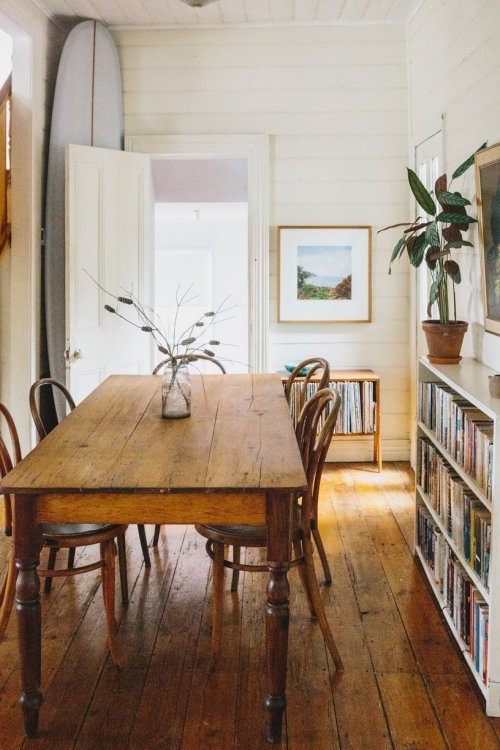
Consequently, my pinterest board has been filling up again with interior inspiration.These beauties are the latest to catch my eye.
source

source
source

source


And one of my very favorite instagram feeds to follow is Christie at Wesandco; she has such a gorgeous sense of style.  Her home is not only beautiful but livable-- she's the mama to four boys!  

Friday, March 25, 2016

Nursery Ideas

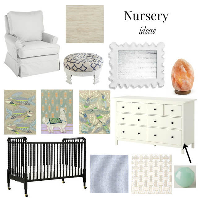
I can't believe I'm officially in the third trimester of this pregnancy as of tomorrow!  And I think a bit of nesting has kicked-in because this week, I felt compelled to pull together some nursery ideas for baby boy #2.  He won't be in the nursery right away, but it's so fun to start dreaming and collecting ideas for when he is.

I have a lot of items that I'm going to reuse from James Robert's nursery (see it here).  The glider, crib and custom seersucker bedding are all things that were excellent investments the first time around that I'll happily be using again.  

We are in a new house and the room that is available to make into the nursery luckily has really pretty grasscloth wallpaper on the walls that are neutral and give a lot of texture.  I'm not going for a theme, but I am obsessed with Lullie Wallace and when I saw on her Instagram that she is doing a series of alphabet animals, my wheels immediately started turning.  

I love the soothing colors and movement in her prints and so that was a jumping-off point to add a few other things to the mix.  Here's what I've come up with so far!

 custom glider, ottoman, mirror, dresser, knobs for dresser, crib, crib sheets, art prints, salt lamp 

P.S.  I had to include the salt lamp in my planning; after reading Robin's review, I've been so excited to try one in the nursery, especially since they have a dimmer.  They are pretty and have such a nice function. Have you used one?  


Thursday, June 27, 2013

Sunroom Before and After

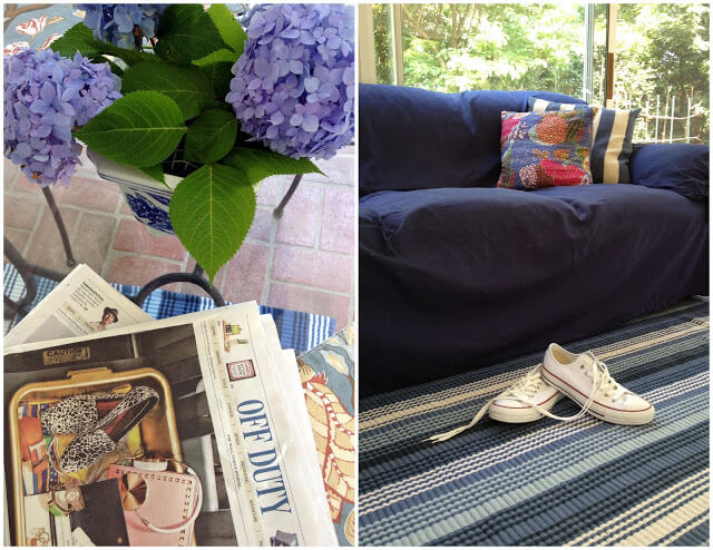
The  radio scilence over here is attributed to figuring out this working mom thing. Hope you'll hang in there with  me!  Suffice to say, it's a work in progress... much like our sunroom.  Our sunroom sat neglected for a few years.  But this spring, we decided it was time to spruce it up a bit and create a space that would allow us to enjoy the extra square footage in our home.

My idea was to extend the feel of the adjacent interior rooms to this outdoor space while keeping in mind the functionality of dining for us and play for James Robert.  While it's not quite "done" {I use that term loosely now... because, when is it ever, really?!}, we are thrilled with the additional living area we've created.

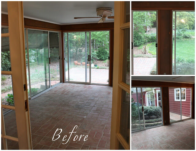
Let's start from the beginning.  Here is square one.  Wood paneled walls on three sides and red cedar siding on a third.
Not to mention a hideously old ceiling fan and unflattering outdoor sconces. 

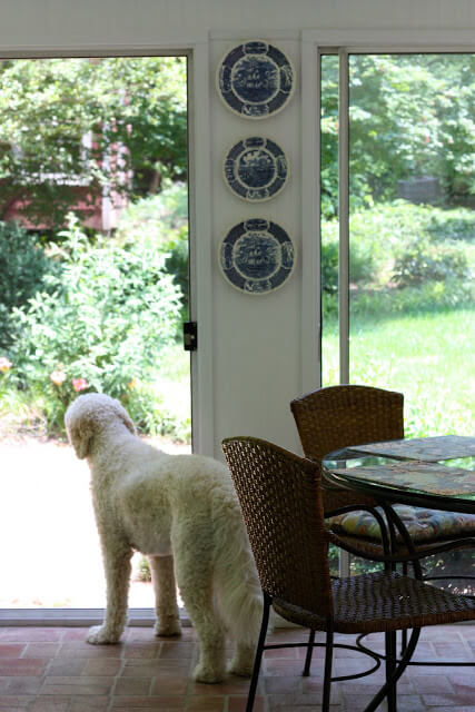
Here's what we ended up with.


Friday, March 22, 2013

James Robert's Nursery

My initial inspiration for the nursery, which I shared here, evolved into a calming, meaningful space that has quickly become one of my favorite rooms in our home.  For fun, I shared James Robert's nursery over on Project Nursery and I'd love for you to head over and vote for us if you're so inclined!
Sources are listed on project nursery, but please feel free to leave a comment with any questions that I may not have covered. 

Tuesday, May 29, 2012

Fill in the blanks update

Last month, you guys really helped me out with suggestions on how to fill in the blanks on my living room wall.  Thank you!  Today, this is what is looks like.

Slightly reminiscent of this.  
{image}

Way better than this. 

I know I owe you some more before and afters...to be continued!

P.S. The MKaltenbach giveaway winner is announced over on Pink to Green's FB page today!

Tuesday, May 15, 2012

Lonny Look for Less

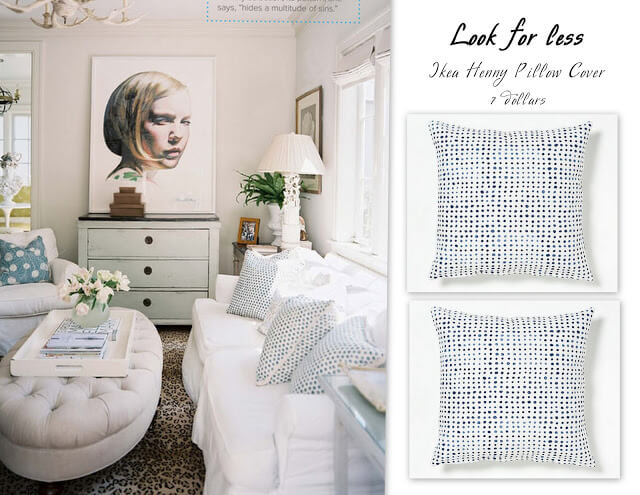
While devouring the latest issue of Lonny, I fell in love with Christy Ford's home.  She is one of the creative masterminds behind And George and I have so enjoyed reading all their press lately.

Her polka dot pillows caught my eye.  They are $395!  If you want a look for less, the Henny pillow covers from Ikea are a close match.  I have a few tossed on our sofa right now and love 'em.

Tuesday, April 10, 2012

Metrolina Recap

Metrolina's spring event didn't disappoint! Ever since Eddie Ross came to Charlotte and showed me the ropes, Metrolina's spring and fall shows have become somewhat of a tradition.

I couldn't have asked for better partners in crime.  This is before we were bogged down with bags.

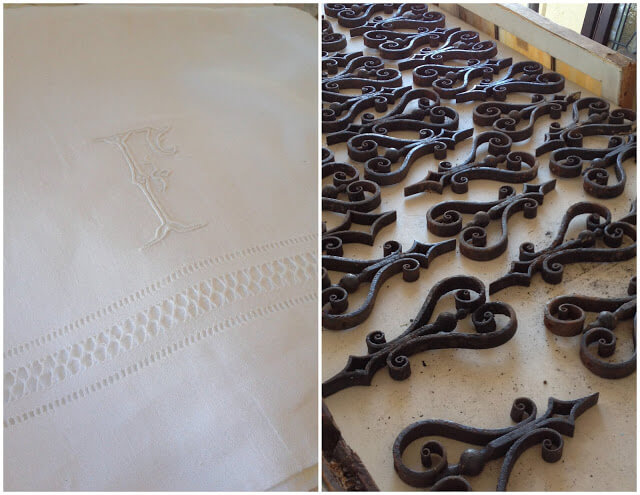
I could have spent hours with the vintage linens.  I walked away with a monogramed hand towel made of Irish linen and promptly added to my bucket list to own a set of bed linens of the same cloth.  They just don't make things like that anymore!  I also scored a few of these wrought iron finials.  Too pretty to pass up, they will find a place in my house.
This antique chesterfield is my husbands dream sofa, so I had to take a picture of me oogling it.  The leather really becomes better with age; it was such a beautiful piece!
A few other pieces caught my eye, but will have to wait for next time.  Vintage charms and bell jars are hard to say no to, so I hope they found a good home.
I'm already marking my calendar for the fall show!  Will you be there?

Thursday, February 23, 2012

Home Sweet Home: Living Room

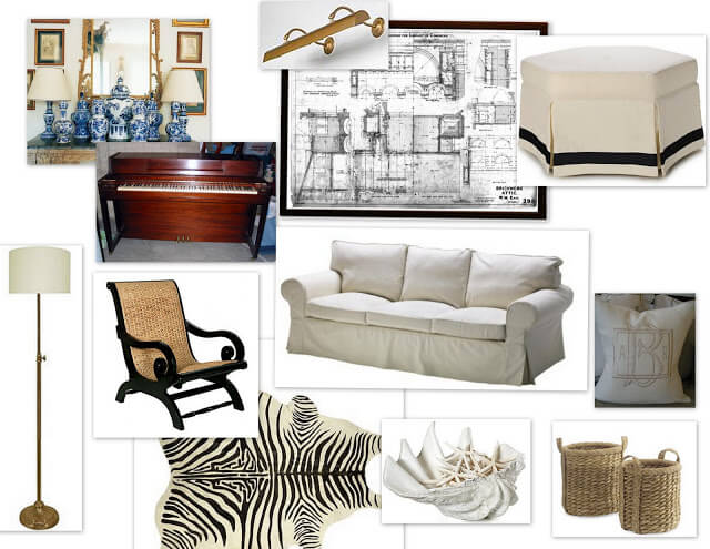
The last, but not least, room in our house to get some TLC is the living room. It has been sitting in despair for too long.  Not to mention, it is a large space that could be better utilized than to just store the piano.  I can't tell you how excited I am to create a space that we can entertain, relax and enjoy.

Here are some ideas of where I want to go.

Here's the state of things right now; painting in progress.
Some lights are being put in soon and then furniture.... I'll keep you posted!

Wednesday, February 15, 2012

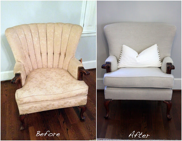
A chair makeover

Giving my great-grandmother's chair a new life is one of my favorite house projects yet. 

What I hoped for was a modern update without sacrificing the femininity of her chair and I think we were able to achieve just that.  
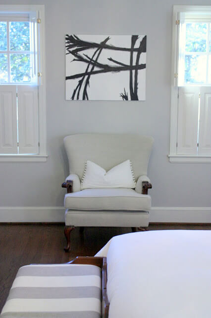
Right now, she is nestled on the far wall of our bedroom, but chances are musical chairs will ensue.  

P.S.  Franz Klein served as the inspiration for the new art in our room; it was my first attempt at painting an abstract. I'm so happy to have something up on the wall!  

For more on our bedroom progress, click here.
For my other chair makeovers, click here and here.

Thursday, January 26, 2012

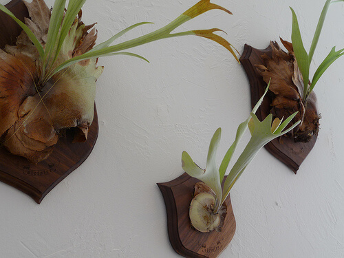
Living Walls: Staghorn Fern

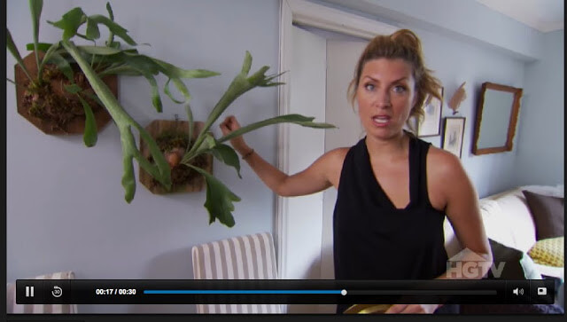
Thanks to Dear Genevieve, my love affair with living walls has been rekindled.  I've written about them before, but couldn't resist sharing some new favorite ideas.
Check out this video to learn about staghorn ferns. Aren't they gorgeous? Antler-like fronds are making plant taxidermy my new favorite decor item. 

 I'm kinda obsessed with them on these mounts; a nod to preppy while being eco-chic? I'm in. 
  • A little clicking led me to Amazon, where I learned you can purchase them. 
  • Here's a DIY on how to mount them.
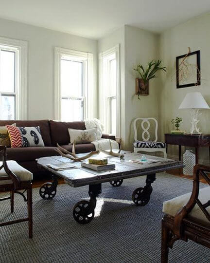
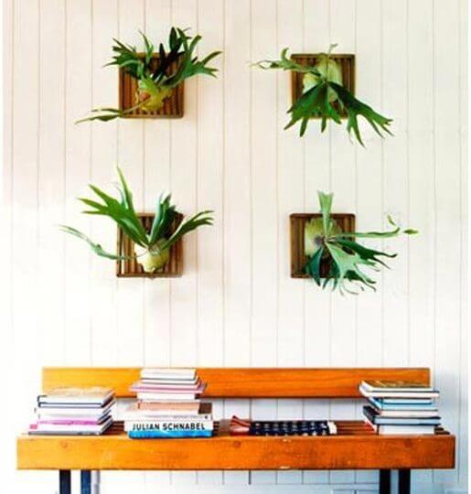
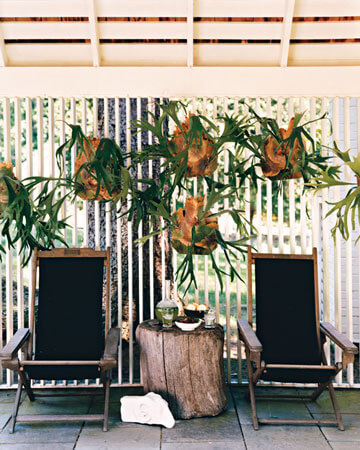
  • And here are some more pictures of them incorporated into home decor


Monday, January 9, 2012

Moving in the right direction

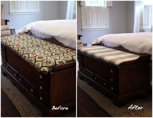
I inherited a cedar chest from my grandmother and wanted to incorporate it into our master bedroom for much needed storage and seating.  And while I appreciate pieces with history, the fabric just didn't fit our aesthetic.  So this weekend, after a trip to Mary Jo's, I used a yard of fabric to upcycle my family heirloom.
{I also got this great floral fabric which I hope to also incorporate}
And because it is fun to look back and see where we came from to appreciate the progress made, this is a picture from shortly after we moved in.
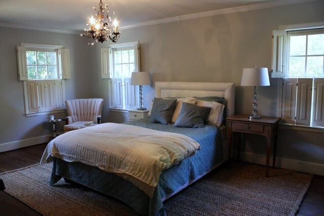
And this is a similar shot of the room now.
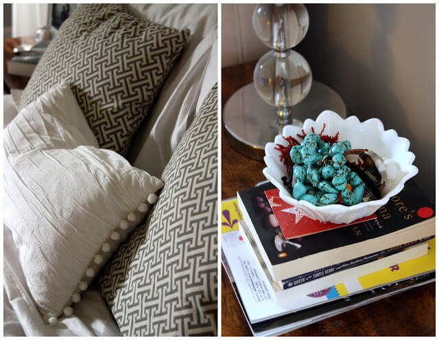
I breath a sigh of relief looking at that second picture.  It makes me feel a sense of calm, the precise emotion I hoped to invoke.  Some of my favorite details are the pillows made with love by my mother in law, bits of vintage milk glass and favorite jewelry on a bedside table...
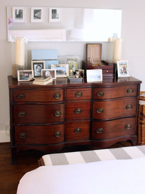
And a display of loved ones with my DIY lavender hurricanes.

The bench pulls it all together, don't you think? {p.s. taking pictures of the room was a bit tricky}
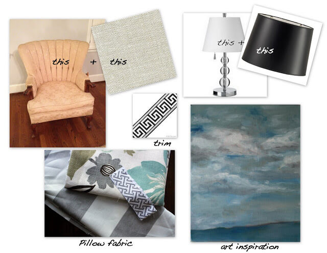
I still think there is a way to go in this space. I'd like to add some trim to the curtains, perhaps swap out the lampshades, add a floral pillow, reupholster the vintage chair in the corner and paint an abstract for the far wall.  Stay tuned!


{Lampshade , Painting inspiration from theobjectathandTrim, fabric from Mary Jo's}